Membership mapping update
Thanks to all who provided feedback on the initial version of the library membership mapping tool. The instructions and details for that testing are available at Library membership mapping. Please read that post if you’d like to get involved in testing. For anyone who didn’t participate, you still can!
Feedback
I’ve split the feedback into a few sections.
General
- It was easy to follow the instructions and quick to go from postcodes to visualising membership data. Great!
- The conversion process was quick. I’ve not done a lot of performance testing on this yet, but it will depend on a number of things (for example a delay while it ‘wakes up’ when not used for a little while). The main thing is that people aren’t left sitting around for too long! (e.g. greater than 5 minutes)
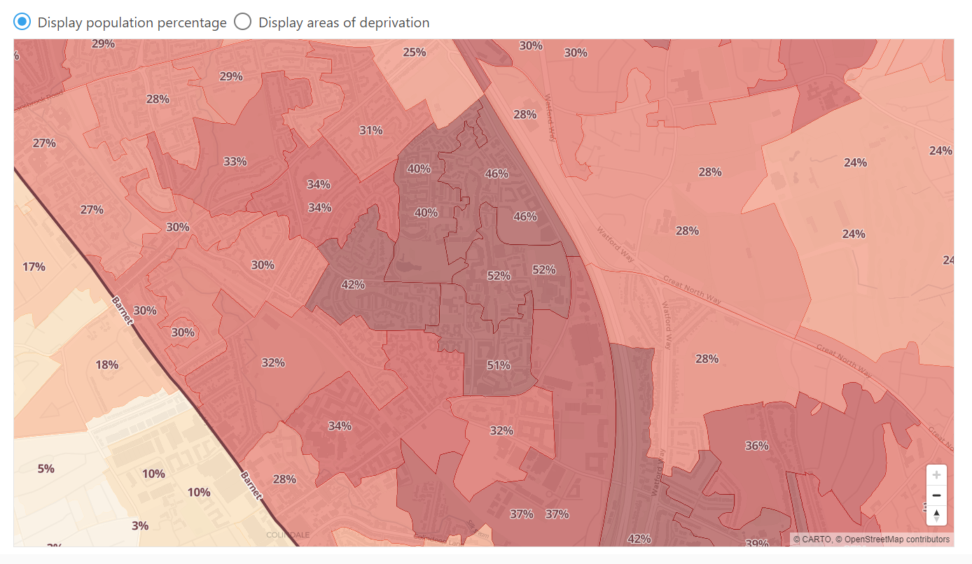
- Some had high levels of the ‘unknown’ or ‘terminated’ postcodes. This is just your own library data and can seem bad, but I don’t think is too much to worry about! Many may be typos from manual entry in your systems (mixing up 0 and O is surprisingly common!).
- It was mentioned it was great to not have to share any data outside of the organisation. This is a key part of the design, and for security in the conversion process. But I should also promote that the final aggregated and anonymous data would be great as open data for anyone to explore.
Map layers
At the moment the two available options on the map are:
- Percentage of the population who are members within each census area
- The index of multiple deprivation for the area
The following have all been suggested as additional layers.
- Location of libraries. This also has a good linkup with the Library map project where I have an initial dataset on library locations (and some mobile library stops).
- Public transport stops and route lines. I think bus stops would definitely be interesting. It will be hard to assess the significance of an individual bus stop, as it could be a service that runs weekly, or every hour. But it could be quite revealing in certain areas. I’ll also look at plotting where the route lines go.
- Ward boundaries. In particular it was requested to display membership and population at this level. That sounds good and is certainly possible.
- Digital exclusion/deprivation. I’ve been interested in mapping this in the past. I don’t believe there is a national open data indicator of this available at the detailed geographies that we’re using. But I know many local authorities have created their own, and I wonder if I could merge various data sources into a good indicator. These often use a combination of factors such as:
- Broadband and mobile speeds (which quite often link to rural/urban classifications)
- Age of population
- Income and employment
- Literacy levels. I’ve had a look at the individual data that goes into the deprivation indicators. Within the educations and skills indicator there are two ‘sub domains’. One covers adults, with the underlying data being English language proficiency and qualifications. Another covers children using data on Key Stage 2 and 4 achievement levels, as well as school absence, and entry to higher and further education. That’s a long-winded way of saying I believe we could show both these as useful literacy-related indicators!
- Other library service data. I appreciate at the moment people looking at this are doing so in isolation, for their library service. However, I would be very keen at trialling neighbouring authorities to share their data, and we could then see how these could be displayed alongside each other.
Map design
- Additional zoom levels. At the moment there is a hard limit on zooming in to see high detail on the base map. This will be adjusted.
- Provide an option to make the map full screen or increase the size of the frame. This should definitely be possible.
- Display multiple layers on the map at once. With the deprivation or membership values it’s one or the other. I think the best way to do this will be to make the shading and the text values independent. The user would then be able to display deprivation as map shading, and membership percentage as the text value (as an example).
- Upload several datasets to tab through. I interpreted this as meaning several membership datasets, and definitely agree there are a couple of uses. I think having something that is ‘longitudinal’ would be useful. For example, load data that spans different ‘snapshots’ and have the tool plot the change in membership of areas, rather than the percentage population.
- Save the file and share directly with managers in presentations. I’m going to add an option to link to data, as an alternative to loading in a local CSV. The user will then be able to share a fixed link with that data already loaded. This could still be data held only on your local network, in which case, only local network users would be able to load the data.
- Printable map. This is technically possible but is always difficult to get into a format that looks good. However, for starters I’ll look at a simple print friendly view.
How to track these updates
These changes are and work items are tracked in GitHub in Membership visualisation project board. Items are currently in the ‘To do’ stage, but will steadily move into ‘In progress’ and then ‘Done’. When done they should be applied into the site. So feel free to keep an eye on that board if there are any features you are interested in.
Please feel free to suggest new features not covered though. Assuming they are useful and interesting to do I’ll add them in!