Library web accessibility
A previous post, public library websites, looked at common problems with library websites.
One problem was accessibility, and ensuring everyone can access online library services.
What is web accessibility?
Web accessibility is covered by the Public Sector Bodies Accessibility Regulations 2018. This says websites should be accessible to level AA from the WCAG 2.1 standard. They must publish an Accessibility Statement to say how this has been achieved, and how problems are being addressed.
2018? That’s old news! There have been two years to get up to standard, ending on 23rd September 2020. Comprehensive guidelines are available at accessibility requirements for public sector websites and apps.
An example of poor web content is links containing ‘click here’. People do this because they’ve seen it a lot. But not everyone ‘clicks’, unless they’re using a mouse. And the word ‘here’ is only valid when looking at a page. It’s making assumptions about how users interact with web pages.
Imagine you are reading a webpage to someone, and they ask which site they could go to from there. You could end up saying “well, there’s ‘click here’, and ‘click here’, and ‘click here’..”. It’s the equivalent of a signpost having ‘this way’ for each direction, instead of place names. Useless, and a way of ensuring people become lost and annoyed.
It’s one of many common mistakes.
Use appropriate contrast for text
You may have a lovely monitor, making your website look great. But not everyone has the same hardware, or the same eyesight. Good contrast between text and background helps make text clear.

Be careful of putting information in images
Many people use screen readers. Images cannot be read, unless alternative text content is provided.
Lots of library websites link to resources by their logo. To library staff, these are treasured and expensive e-resources. To the public it’s a meaningless series of logos they’re unlikely to follow.

Don’t use colour alone to convey meaning
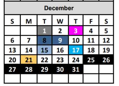
Colours are great. But it shouldn’t be necessary to recognise them. Services need to find different methods to convey meaning. For mobile library information, this means not having a calendar with dates coloured to indicate when the mobile library is visiting.

Accessible design is better for everyone. Everyone wants well laid-out content, with plain language and descriptive links. These things are win-win, they make a site easier to use and increase usage.
The best websites make mistakes. I’m no accessibility expert, and there’s no substitute for user testing. By trying to follow guidelines, attempting good content, and publishing a statement, it shows that you care about trying to make things better.
How are libraries doing?
Feedback from the previous post about library webpages was that it wasn’t always the library’s fault. “Libraries aren’t allowed by the council to change the web content” was the argument.
And that’s understandable. How can you make something better if you’re not allowed to? But this isn’t always true. Local government has good shared practice. If you join the Local Gov Digital Slack group you will see a thriving community of people who have been discussing accessibility issues for the past two years.
I also noticed content on library catalogue sites, away from council interference, was particularly bad. The greater the library involvement, the worse things were.
To try to eliminate council influence I looked again at library websites, but only where the website wasn’t part of a council site. The test was simple, how many had an accessibility statement that would comply with the legislation?
Of 34 sites, there were two compliant.
What about national organisations? Libraries Connected and the Scottish Library and Information Council are charities, but also subject to the legislation. Neither had Accessibility Statements, and both had accessibility issues.
There was at least one exception. Leeds Libraries are clearly putting a lot of effort into accessibility, and doing their best to work with suppliers to provide good websites.
Who cares?
Do libraries care about any of this? Given current standards, no, with exceptions.
But that’s not malicious. For users accessing physical libraries they will experience a top-class service: accessible buildings, large print books, guidance on using the Internet, etc.
The problem is digital literacy. Web accessibility is seen as a ‘tech’ thing. Either the responsibility of IT, or website providers. Even though it affects library services.
There are other symptoms of digital literacy problems. Library online presences look like adapted print experiences. Reports from library organisations are normally PDF files. That’s not online publishing, it’s print formats available to download.
Gerry McGovern, a particularly good writer on web content, summarised the use of PDFs in a recent tweet.
One of the best ways to measure digital information illiteracy is to measure the quantity of PDFs an org creates. A PDF is a sure sign that an org has not adapted to digital but is rather forcing digital to adapt to its print culture and practices.
— Gerry McGovern (@gerrymcgovern) July 19, 2020
Libraries have been forced to push their practices online, without adapting them. Over the summer many services used poster templates to put their events into image format, and then posted these on social media. In some cases the image was the only available listing of events. That isn’t a digital service.
What to do?
Well, I don’t know. Previously this was just a bit rubbish. Now it’s illegal.
Will that trigger a change? Probably not directly. But if enforcement action is taken then it’s possible. The legislation is enforceable by the Equality and Human Rights Commission. The public have a clear right to accessible public websites, and they can demand this through the EHRC.
