September accessibility challenge
I hate PDFs.
Is that irrational? If it were regardless of context then possibly. So, I’d better clarify: I hate PDFs when they’re used to publish important online information.
PDF stands for Portable Document Format. And for what they’re designed to do, they do it. Transferring documents so that they can be accurately reproduced elsewhere with fixed text and graphics. For example, as a method of sending a document to be printed they’re fine.
As web content they’re not OK. While browsing the web people use a lot of different devices and screen types. Web browsers are specifically designed to display web content, with additional features such as being able to increase the size of text, use screen readers, change contrast, etc. Web content is not fixed text and graphics - on a mobile phone a paragraph may be ten lines, on a desktop, 3 lines.
There are people who argue that PDFs are fine, as long as they are made accessible. They can’t be. They are fundamentally inaccessible because they aren’t web content and need to be downloaded and viewed separately.
There are many other reasons why PDFs are bad: they consume too much space, waste energy, and encourage printing when we should be doing the opposite. See why GOV.UK content should be published in HTML and not PDF for the Government Digital Service’s view on the matter.
What happened?
This week the Scottish Library & Information Council (SLIC) released a long-awaited strategy titled Forward: Scotland’s Public Library Strategy 2021-2025. Clearly vital public information, and undoubtedly a lot of great work by many involved.
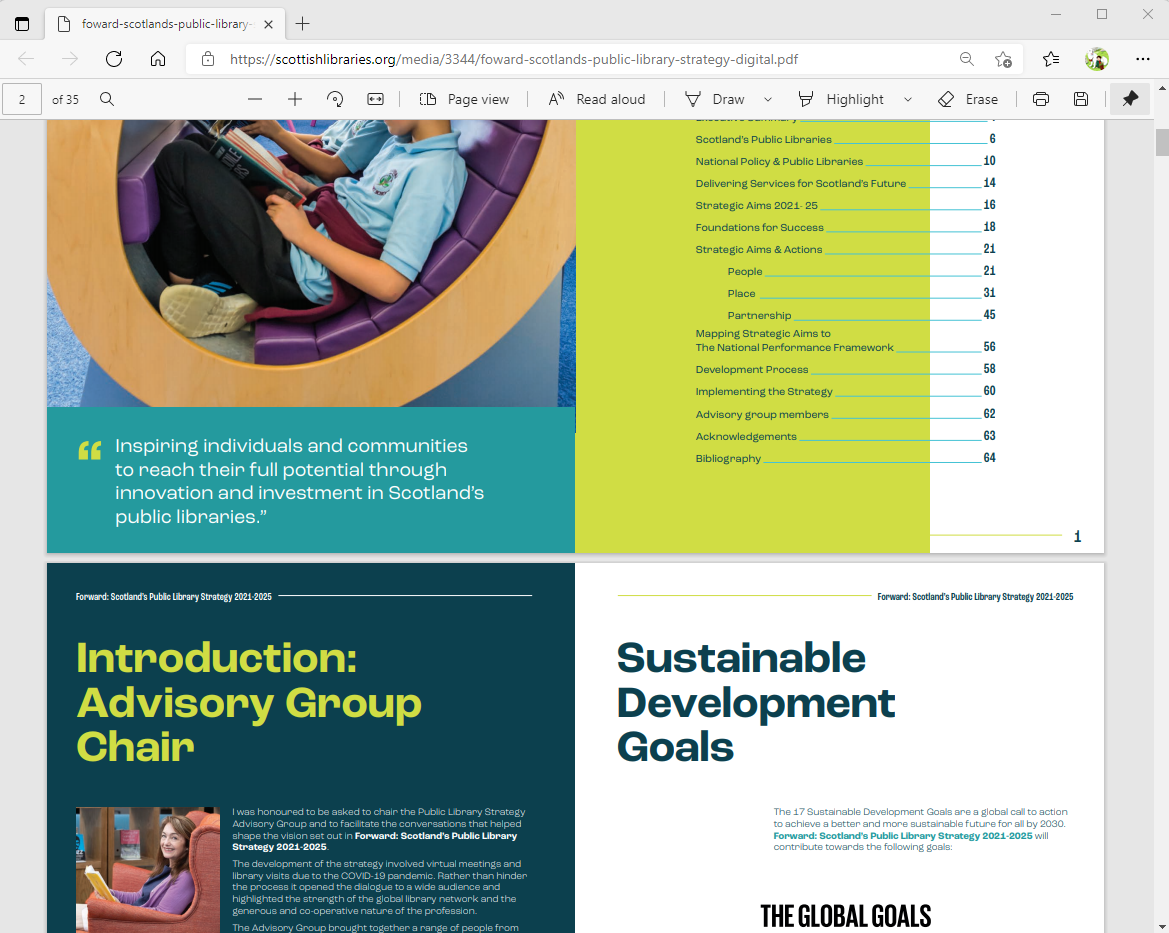
But as with many public library reports, it was released as PDF. There may be a few with the luxury of reading it on paper, but it’s a horrible experience to read on a screen. Why did that happen? It’s a lot of information that would be better suited as web content. Findable from search engines, easily linkable, including particular sections, and something that far more people could read and (re)use.

Publishing it exclusively as a printable document serves so few people it’s a staggering thing to do for the sector. Yet it would be unfair to SLIC to wholly single them out on this. This is a common occurence, and comes from trying replicate a print culture on the web.
What to do?
OK, but this doesn’t actually help.
What can be done? Aside from trying to persuade people not to do this in future, which has never succeeded, there are some practical steps. There is lots of great information in the PDF, so let’s get it out. How about a separate website to showcase and provide the whole strategy within a series of well-indexed and attractive pages?
I’m taking it as a September (2021) challenge - but by all means anyone interested please do get in touch and I’d be happy to talk about it.
I think the following would be a good rough set of requirements.
- Be easy to read on all devices.
- All the same text and graphics as the PDF. Just copying and pasting the text into a web page won’t cut it.
- Accessible to WCAG 2.1 AA standard. This is the current legal requirement for public sector websites.
- Easily linkable. Anyone should be able to easily link to a particular section of the strategy.
- Optimised for search engines (SEO). Different sections of the strategy should appear as separate results in search engines, with their own descriptions.
- Optimised for social media. If people share a link then social media should show an appropriate information card.
- Delivered without cost. Aside from time and effort (which is a big aside) this shouldn’t be a costly solution. It should use free online hosting and tools.
- Lightweight. The strategy PDF is about 10MB of content - a huge download. The website should include all the text and graphics but provide these with a much smaller energy footprint.
